Viewing entries in
"studio photography"

Comment

Sports Team Portraits a Different Way


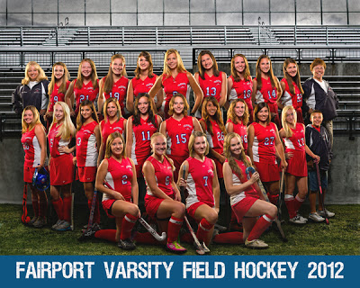
Field hockey team that was composited from 26 individual photos of the individual athletes


Luke Photography has been working with the booster clubs at the local high school do create unique and interesting team and individual portraits of the high school athletes. Sports are really a big part of Fairport High School's environment, and they really were interested in something different than the tried-and-true standard athletic photos that most teams get.
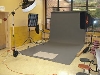

Lighting set up:
Overhead beauty dish, two gridded soft boxes
left and right behind the subject, and an umbrella
on the background

After arranging for use of the school's cafeteria, I set up my mobile studio using a four light setup and grey paper background.  The main light on the subject is an overhead strobe in a 24 inch beauty dish, which gives off a soft but edgy light that I love for athletic portraits. There are two strobes placed diagonally behind the subject that are outfitted with medium-sized gridded soft boxes. These lights provide nice separation light behind the subject, and are usually placed to match the digital that I plan on putting behind the subjects. Finally, there is a strobe that is bounced out of an umbrella that lights up the background.
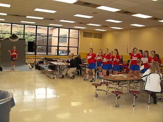

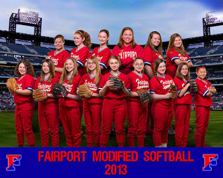
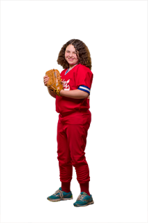
The Fairport Modified girls' softball team ready
for their Hollywood close-up.

Raw image

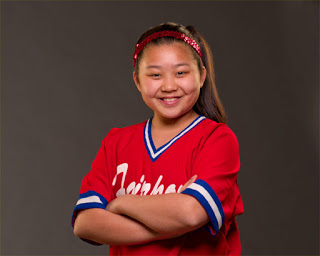
The raw image out of the camera looks like this. A quick pass of retouching is usually done on the face, if there are any blemishes or shadows that can easily be taken care of.
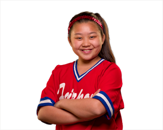
Background stripped out

I usually Topaz Remask, a Photoshop plug-in, to strip out the subject from the background.  Each player can be done in 8-10 seconds.
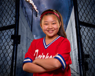
New background image inserted behind subject

A new digital background is placed behind the subject. I create many of my own urban backgrounds (e.g parking garages, industrial buildings, etc.), but these stadium backgrounds were purchased from StreetscapeBackgrounds.
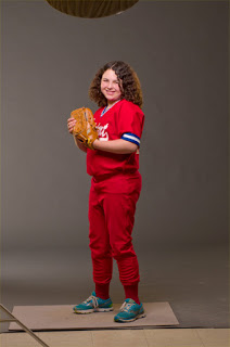
Raw image

To create the composited team  portrait, I photograph each player facing directly towards the camera, then at a 45-degree angle to the right, then to the left. Using Adobe Lightroom to filter through the images, I pick the best image of each player, trying to get equal numbers of "lefts" and "rights", and several facing directly at the camera.
Background stripped out

Using Topaz Remask, the subject is stripped out of the background.


Using Adobe Photoshop, each player is placed into the image, row-by-row to create a pleasing arrangement.  There are multiple blank layers that are added above and below each player's layer on which I brush in shadows, which would occur naturally if the team was actually photographed all together. These shadows make all the difference in the image, and although time consuming, turns this from a run-of-the-mill fake image into one where most of the parents can't believe the athletes were not all photographed together. 

When complete, there are often 45-50 layers in the Photoshop file: one for each player, at least one shadow layer per player, and several other shadow layers where their feet are touching the ground. In the photo above, several players were wearing flip flops or were in stocking feet, so the team name banner covers up the bare feet of the front row players that could not be hidden in the back row.


Everyone is still smiling when they're done.

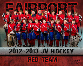
The JV hockey team shown below was one of the first teams that I created this way.  The individual player's photos again were close ups of their faces in front of a really nice rink background.  When the hockey parents show the team photos around, I soon had baseball, field hockey, softball, football, boy's lacrosse and girl's volleyball teams on board.  

Many people ask me why I photograph team portraits this way, because it is much more a time investment than just lining a team up and photographing them all together.  First and foremost, it allows me to get great, consistent light on each and every player's face.  This is not always easy to do in a large group.  The accent lights that appear on each player's face helps define it and delineate it from the players behind them.  There is no way this accent light would get onto the player's faces at the center of the group if they were all photographed together simultaneously.  The second reason is that it looks different. Being different gets you noticed.  Executing this different vision on a consistent basis keeps you moving forward, onward and upward.

One of the first team composites that I created.
Once other teams caught wind of this , they were lining up to take part

Comment

Comment

Ashley - Fairport HS Senior portraits


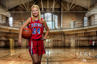
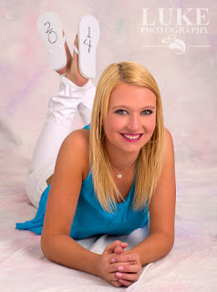
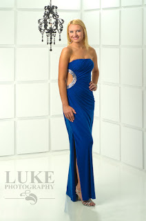
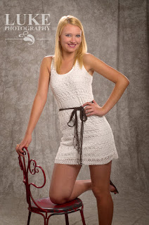
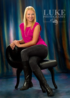
Ashley is the 3rd model representative from Fairport's Class of 2014 to have her senior portraits taken at Luke Photography.  She plays basketball almost year-round and is a starter on Fairport's varsity basketball team.  She is tall and statuesque and looks as much like a model as any athlete I've had come through the studio.  Although she was getting over a cold and didn't feel well, she certainly gave all her energy during the 3-hour session, then has to turn around that evening and go to work.


I really love it when people bring in their own ideas for their portraits, and Ashley did not let me down.  She had seen this idea of writing her graduation year on the bottom of her flip flops, so that it would show up correctly when her feet were crossed while lying on her stomach..it didn't just happen that way....there is actually quite a bit of planning to make sure it looked right.


Ashley's royal blue prom dress really made her stand out against the new high-key set wall in the studio.  We made sure her pose showed off the leg slit and the peek-a-boo cutout in her dress.  Very stylish and chic without showing too much.


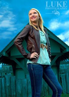
For this image, Ashley was posed outside along the canal.  For all the photographers out there, here is the geeky part: the camera was set to tungsten white balance, which produces a blue color cast over everything when photographed outdoors during the day.  Orange filters were placed over the two flashes in the soft box which she is looking towards, which corrected the light on her face and skin, rendering it a neutral tone.  This trick is used to create impact lighting out in daylight.


Depending on what color the subject is wearing, different colors pop out from this background.  Ashley's fuschia top made the pinks in this background really stand out, but nothing stands out more than Ashley, who looked fantastic all day, and was so comfortable in front of the camera.


Comment

Comment

Photographing Beer


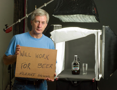
I recently started photographing various trademark beers for Fairport Brewing Company, a local microbrewery.  Although all the foods and beverages that you see in magazine and television advertisements look deliciously steamy hot or refreshingly cold, nothing could be further from the truth.  There is an art to making month-old, cold hamburgers look lip-smackingly good.  And in this post, I’ll show you what makes you want to dive into room temperature, flat beer.

With the exception of some English beers that are preferable served less than cold, most beer is served cold, so that is what advertisers want you to see and crave.  But again, what you see is rarely what it really is.


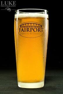
“Hero” Shot


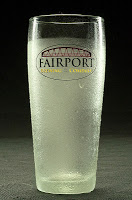
Frosted with aerosol deoderant

To get this photo of one of this brewery’s IPA’s, I started with one of their signature logo glasses.  To make the beer seem like it sitting in a frosty glass, I masked off the very top of the glass with a piece of paper, then lightly sprayed the rest of the glass with the cheapest aerosol deodorant that I could find at my local supermarket.  You really want to “cheap out” here, because the more expensive brands go on clear, and you want the frost.  A side benefit is that the studio smelled spring fresh after each and every spray.
Glycerine and water

Next step is to spray the frosted area of the glass with a 50/50 water and glycerine mix.  You can find glycerine in your local pharmacy…it’s in the “constipation” aisle…so don’t spend a lot of time there browsing.

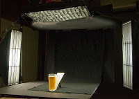
The glass is then placed in the lighting set-up, which included one overhead light in a gridded soft box and two side lights, each in a gridded strip box.  These side lights were placed slightly behind the glass to add to the rim light effect of the glass and show off the water droplets.

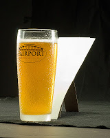
Cardboard reflector
The trouble with this lighting set-up is that there is not a lot of light going through the glass, and not matter what kind of beer you are photographing, it’s going to look dark and cloudy…and very unappetizing.  The trick is to take a cardboard cutout similar to the shape of the glass and angle it directly behind the glass, so that it won’t show from the camera’s angle.  This cardboard will reflect the light from the overhead soft box, and send it shooting through the glass, instantly elevating the status of the beer from dark and cloudy to refreshingly delicious.  Hard to remember that it’s still warm and flat.  And speaking of flat, when you are ready to photograph the beer, drop some salt in the glass.  This will produce bubbles and bring back the head of the beer.
Hero shot lighting setup

As an alternative to shooting against a dark background, I also replaced the dark background with a large soft box, and adjusted the light in it to give me a nice white background.  This produces a lot of light coming through the beer and avoids the dark, cloudy look altogether.


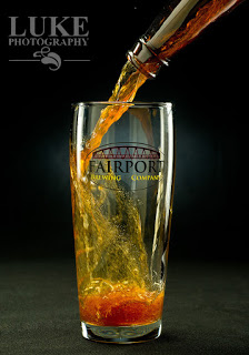
“Pour" Shot


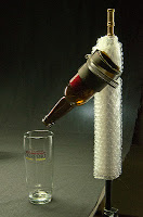
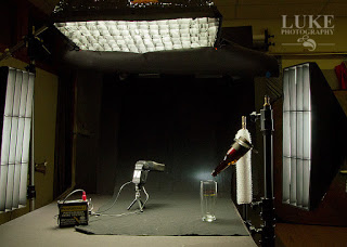
I took an empty beer bottle (I had several to choose from at home) and using a glass cutter purchased from my local big box hardware store, cut off the bottom of the bottle and sanded the edges to they were smooth and would not cut my tender fingers..  I then clamped the bottomless bottle of beer…which is the ultimate fantasy….to a light stand.  Doing this allowed me to place the glass and the bottle in exactly the same position for each and every shot, and I simply just pour a cup of beer into the open part of the bottle while firing the camera. 


The logo on the glass did not show up well against the dark background in the first several shots, so I added a small snooted flash directed at the background, directly behind where the logo would appear in the photo.

Again, flat beer works best in this kind of photo.  Otherwise, all you’ll be taking a photograph of is foam on the bottom of the glass, which is less tasty than the amber-colored goodness of grain,  hops and yeast.


Comment